
How Do I Choose the Right Paint Color for a Dark Room
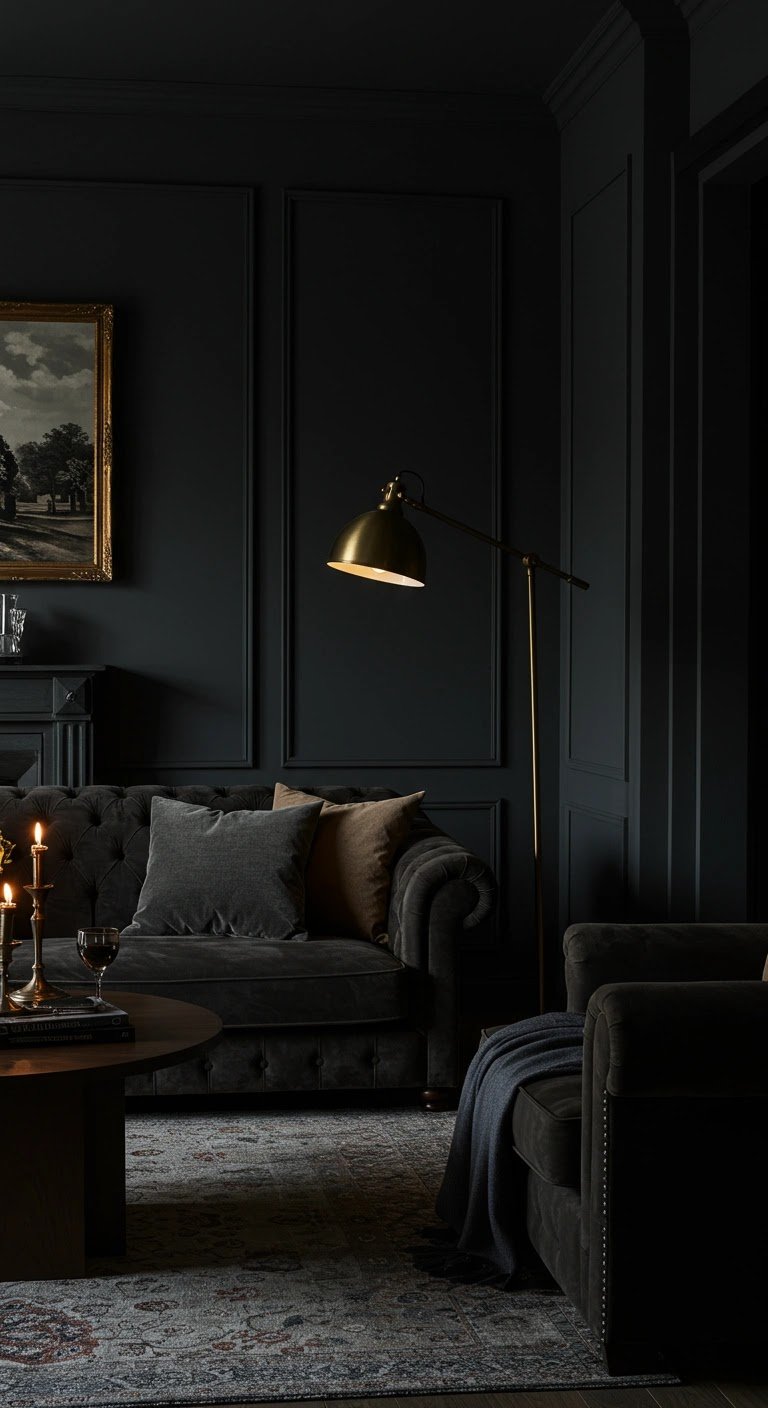
Dark rooms are tricky. Paint them white and they can look gray and gloomy. Paint them dark and they can feel like a cave. I spent years getting this wrong in my north-facing living room — it cycled through three shades of “sad beige” before I finally understood what was actually going on with light, color, and perception. The right paint color doesn’t just decorate a dark room; it fundamentally changes how the room feels.
Here’s how to choose the right paint color for a dark room, based on how light actually behaves rather than what looks good on a tiny swatch.
How Do I Choose the Right Paint Color for a Dark Room?
The key insight: dark rooms don’t lack color — they lack light, and your paint choice should work with the light you have, not fight it. That means understanding your room’s natural light first, then choosing colors that complement it. A color that looks bright and airy in a sun-drenched showroom can look muddy and depressing in a north-facing bedroom.
Step 1: Understand Your Room’s Light
Before choosing any color, observe your room’s light throughout the day. The direction your windows face changes everything:
- North-facing rooms get cool, bluish, indirect light all day. They never get direct sun, so they always feel a bit cool and dim. Colors will read cooler and darker than the swatch.
- South-facing rooms get warm, bright light for most of the day. Colors look truest here — but a south-facing room is rarely “dark” unless windows are small or obstructed.
- East-facing rooms get bright warm light in the morning, then cool off in the afternoon. Colors shift noticeably through the day.
- West-facing rooms are dim in the morning and get intense warm light in late afternoon and evening.
Also assess how much light you get: window size, obstructions outside (trees, neighboring buildings), and interior factors like dark hallways that swallow light before it reaches the room.
The Two Schools of Thought: Brighten or Embrace
Designers generally take one of two approaches to dark rooms, and both work — they just create different moods:
Approach 1: Brighten and Reflect
Choose light, warm colors that bounce around whatever light exists. The best choices aren’t stark whites (which can look gray and flat in low light) but whites with warm undertones: creamy whites, warm off-whites, pale peachy tones, light warm grays (“greige”). These colors reflect light without the cold, clinical feeling of blue-white.
Why warm undertones matter: in a north-facing room with cool light, a cool white looks icy and depressing. A warm white counteracts the blue cast and feels inviting. It’s color theory working in your favor — you’re literally warming up the light with your walls.
Approach 2: Embrace the Darkness
The counterintuitive alternative: go dark and moody on purpose. Deep navy, charcoal, forest green, or rich chocolate in a dark room creates a cozy, enveloping, sophisticated space — a library or den feel rather than a failed bright room. Dark colors in dark rooms hide the lack of light instead of advertising it.
This works best in rooms where coziness is the goal: bedrooms, dens, dining rooms, home offices. It works poorly where you need energy and clarity, like kitchens or kids’ playrooms. If you go this route, commit fully — wimpy mid-tones are the worst of both worlds. And add plenty of layered artificial lighting (more on that below).
The Worst Choices for Dark Rooms
Whatever approach you take, avoid these: cool grays and blue-grays in north-facing rooms (they amplify the cold, gloomy feeling); dingy mid-tone beiges that look dirty rather than warm in low light; and bright saturated colors like vivid yellow or red, which can look harsh and artificial without natural light to soften them. If you love a bold color, use it as an accent — a single wall, or in furnishings — rather than all four walls.
Lighting: The Other Half of the Equation
Paint can only do so much; artificial lighting does the rest. Dark rooms need layered lighting, not a single overhead fixture:
- Ambient light: ceiling fixtures or recessed lights for general illumination. Use warm-white bulbs (2700–3000K) to complement warm wall colors.
- Task light: table lamps, floor lamps, and reading lights where you actually need brightness.
- Accent light: picture lights, LED strips, or uplights that add depth and make the room feel designed rather than just lit.
- More sources, lower intensity: five lamps around a room beats one bright overhead every time. It eliminates harsh shadows and creates warmth.
Also maximize what natural light you have: use sheer window treatments or none at all, keep windows clean (dirty glass blocks surprising amounts of light), and place mirrors opposite windows to bounce light deeper into the room.
Always Test Before Committing
This is non-negotiable for dark rooms: paint large test swatches (at least 2×2 feet) on multiple walls and live with them for several days. Observe them in morning, afternoon, and evening light, plus under your artificial lighting at night. Colors shift dramatically in dark rooms — a swatch that looks perfect at noon can look completely different at 7 p.m.
Buy sample pots rather than relying on paper swatches or phone screens. The $5–$10 per sample is the cheapest insurance in all of home improvement. And test the sheen too: eggshell or satin reflects more light than flat paint, which can help in dark rooms — though it also shows wall imperfections more, so prep accordingly.
For more on application technique once you’ve chosen, see our guide to painting a room like a professional. If you’re choosing colors with resale in mind, check the best paint colors for selling a home.
Don’t Forget the Ceiling and Trim
The ceiling is the fifth wall, and in a dark room it matters enormously. A bright white ceiling reflects light downward and makes the room feel taller — never paint a dark room’s ceiling a dark color unless you’re deliberately going for a cocoon-like effect. For trim, a crisp white or warm off-white creates contrast that makes wall colors look intentional and rooms feel finished. If your walls are dark and moody, white trim provides the visual relief that keeps the room from feeling oppressive. These aren’t afterthoughts; they’re part of the color scheme.
Practical Takeaway
Study your room’s natural light direction first, then either brighten with warm light colors or embrace the dark with rich moody tones — avoid cool grays and muddy mid-tones. Layer your artificial lighting generously, use mirrors to multiply natural light, and always test large swatches for several days before committing. The right color doesn’t just paint a dark room; it transforms how the room feels to be in. Sherwin-Williams’ color tools let you preview shades in different lighting conditions before you buy.